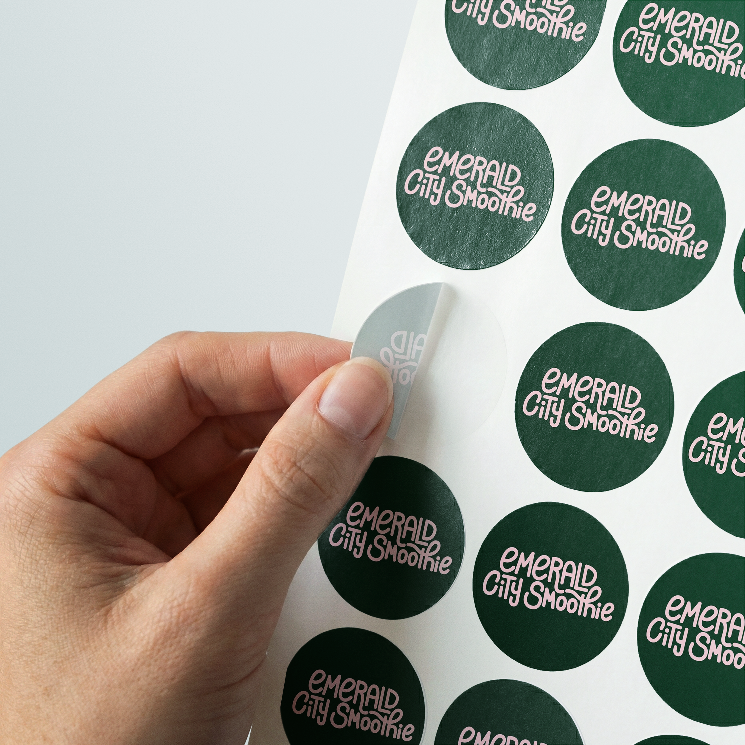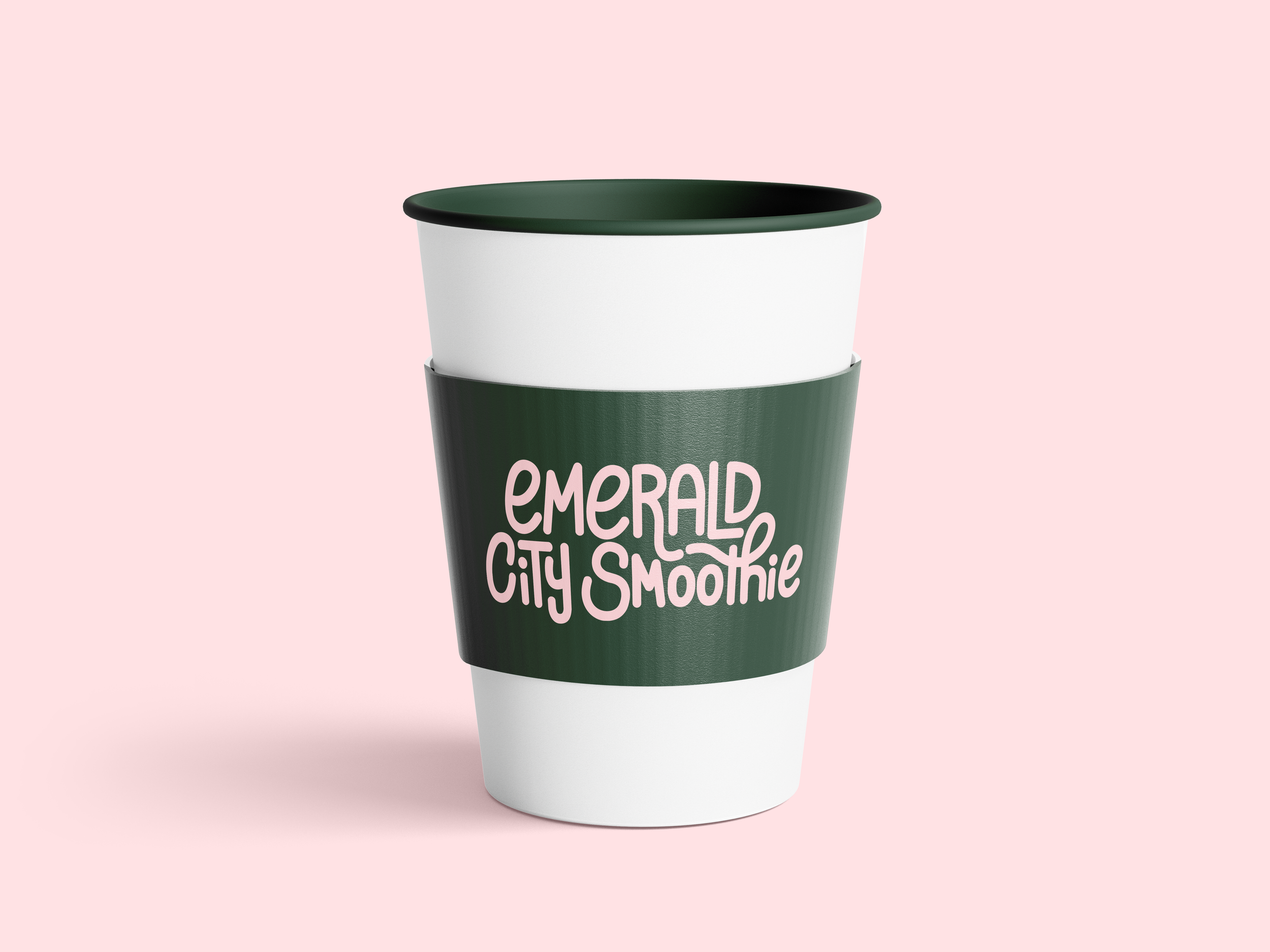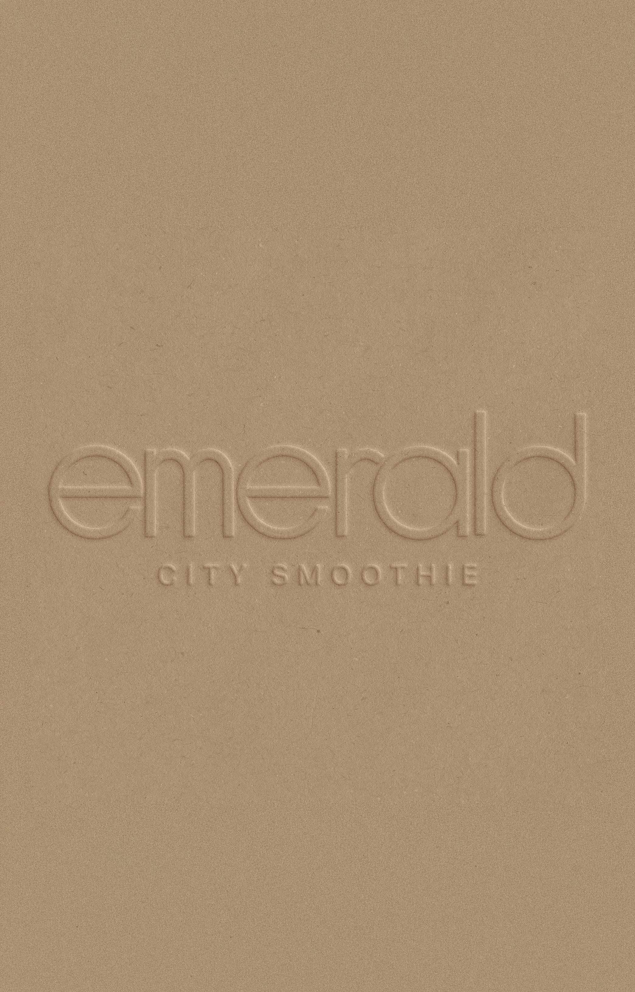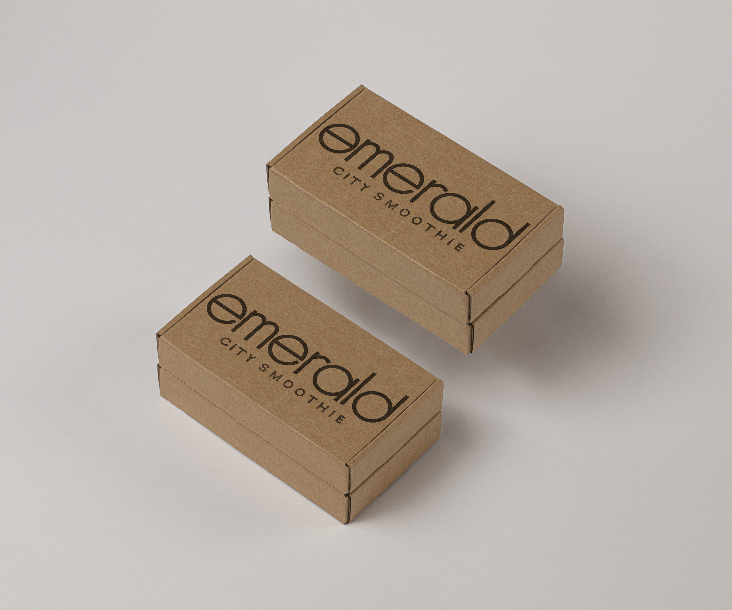
Logotype Redesign
For this project, I developed two different hand-crafted logotype system options for Emerald City Smoothie. I researched the brand’s identity, audience, and values, selecting a series of guiding words that helped shape the visual direction and overall tone of the work. Overall, I explored how typography could communicate different facets of the company’s personality and mission. The project ultimately resulted in two distinct final design directions, each featuring a handmade logotype that emphasized a different key aspect of the brand.